Ecommerce landing pages are the foundation for drawing in customers and have to create a memorable experience.
To achieve this, it is crucial to build landing pages that are specifically designed for high conversion rates. This blog post will cover important topics related to high-converting ecommerce landing page design, along with ecommerce landing page best practices. We will also introduce effective ecommerce landing page examples to illustrate how focused messaging and design can enhance customer engagement and sales.
Make sure that every aspect of your site speaks volumes and captures attention by using these key strategies!
Key Takeaways
Ecommerce landing pages are designed to promote products and offers, targeting the right audience and encouraging conversion.
The success of an ecommerce page relies on clear & compelling headlines, engaging visuals, persuasive copy & strong calls-to-action. Effective landing pages can significantly improve return on investment by maximizing conversions for the same ad spend, ultimately reducing overall advertising costs.
Optimizing with mobile responsiveness, simplified navigation, social proof & consistent branding is essential for increasing conversions.
Understanding Ecommerce Landing Pages
Ecommerce landing pages act as the doorway to an online store, offering potential customers a chance to interact with your business’s brand, goods or services. Their main purpose is converting visitors into buyers by promoting and featuring one call-to-action in particular.
An effective ecommerce landing page can significantly improve conversions from any ad campaigns conducted.
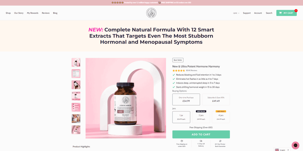
Companies like Happy Mammoth have heavily invested in Direct Response style landing pages, fused with a traditional Ecommerce Layout that’s responsible for selling millions of dollars of supplements.
Creating a successful ecommerce landing requires targeting specific audiences, highlighting key action points while including persuasive factors that convince users of its worthiness. All dependent on how well it has been designed aesthetically. For maximum effect, make sure you have implemented an efficient plan for creating optimized forms of this important asset known as ‘ecommerce landings.’’
Definition and Purpose
Creating a great ecommerce landing page for an online store can be instrumental in converting visitors to customers. Introducing a compelling brand story can engage visitors on top of funnel landing pages by effectively communicating the brand’s mission and solutions. The web page must possess compelling headlines, visuals and calls-to-action that guide users through the sales funnel towards conversion. To create such high-converting landing pages, businesses should refer to promotional landing examples available on the internet or draw inspiration from successful cases like MeowBox’s one, featuring both subscription options and single purchases opportunities. A well designed ecommerce site offers maximum benefit when it uses relevant strategies catered specifically at boosting conversions while showcasing its offer/product with efficiency too!
Types of Ecommerce Landing Pages
When it comes to ecommerce landing pages, there are many types that serve different purposes in the sales funnel, including product landing pages designed to educate and persuade potential customers before directing them to product pages for purchase. Another effective type is the promotional landing page, which can attract and engage potential customers by offering discounts or building anticipation for new products.
Product-focused ones (often known as product pages) focus on one item and aim to motivate visitors to take action regarding this particular item. Category-specific landing page designs provide information about special promotions or deals with the purpose of directing customers along their purchasing journey. For example, TRIBE crafted an “Exclusive Shortlist Offer” which guided potential subscribers through their process while Savile Row made a specialized page for British shoppers searching men’s shirts formal wear. Producing targeted versions of these sites can help direct users better throughout your company’s selling path and make them more inclined towards buying from you. Simply taking into consideration how they have been implemented by others should be all the insight needed!
Key Elements of High-Converting Ecommerce Landing Pages
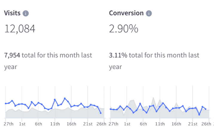
Good conversion rate is critical to making your store profitable. 3% is a good foundation to aim for.
Creating a well-structured ecommerce landing page is essential to maximizing conversion rates. The entire landing page should maintain focus on a single call-to-action, ensuring all elements work cohesively to guide visitors toward that goal. Additionally, product descriptions are crucial for enticing potential buyers and addressing their concerns.
A successful landing page design ensures users have an enjoyable experience from start to finish, leading ultimately to higher sales and profits for your business. By focusing on these key elements, you can optimize the performance of your ecommerce landing page – which means more visitors as well as increased conversions!
To find out how potent the impact of increasing your Conversion Rate can be, check out this Conversion Rate ROI Calculator.
Clear and Compelling Headlines
A headline that is well-written should be the first aspect to grab a user’s attention and present the core value of an offer. To construct this kind of captivating, transparent headline: making it big, strong and simple, including a subtitle which highlights benefits, using straightforward words without perplexing jargon. Avoiding ambiguous language – are all very important elements to remember when creating one for your landing page’s optimization purposes on ecommerce sites.
Not only will adding visuals alongside text make sure visitors take notice, but also placing focus keywords in order to boost SEO performance can help improve performances drastically with regards to these pages so conversions may increase as desired results from properly crafted headlines become more apparent. A powerful statement capable of stirring excitement at initial glance is key when striving for positive outcomes related to ecommerce landing pages, hence why crafting such a headliner carries great significance if optimal achievements are sought after here.
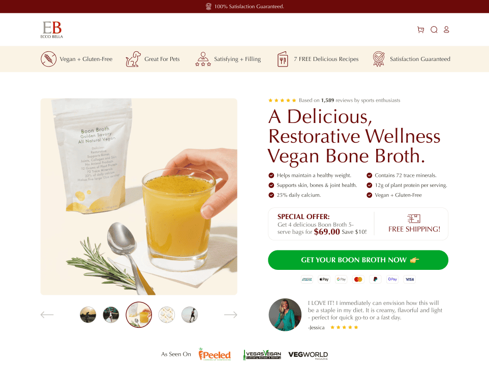
Ecco Bella’s Bone Broth lander is a good example of a strong, benefits-driven headline being used to sell the outcome of their product.
Engaging Visuals
To capture the attention of potential customers, a well-crafted ecommerce landing page should make use of captivating visuals such as high-quality images and videos to clearly communicate product features and benefits. Porcelain’s ‘Skin Discovery’ homepage utilizes people in its photos to illustrate their focus on providing a tailored experience for each customer. Making it easier for visitors to imagine themselves being part of this process with better skin results. By utilizing compelling visuals, you can create an effective, persuasive ecommerce landing page that encourages conversions.
Persuasive Copy
When it comes to designing an ecommerce landing page, the copy should focus on what will satisfy a visitor’s needs and desires. To get customers through the sales funnel in order to take action such as making a purchase or signing up for something like email newsletters, this kind of text should be crafted persuasively while highlighting key features that may benefit them. For instance, Troubadour did this by including customer testimonials with their Explorer Quickdraw Rucksack offer which made it highly converting resulting in more sales. Through creating effective and persuasive copy directed at your target audience, you can build high-converting landings that make purchases irresistible!
Flux Academy do a great job of running through the core concepts in this video.
Strong Call-to-Action (CTA)
A successful ecommerce landing page must have an eye-catching and convincing call-to-action (CTA) to motivate visitors into taking the desired action such as subscribing or purchasing. Making sure your CTA stands out on the page, is easily understood by users and communicates value will help you effectively guide customers through their purchase journey while also boosting conversions. For instance, Marley Spoon’s “Perfect Dinner” webpage demonstrates this perfectly with its highlighted “Start Cooking” button that led to a 25% conversion rate! Including a solid CTA in your ecommerce landing can drastically impact CTR (Click Through Rate) and sales for businesses alike.
Best Practices for Designing Ecommerce Landing Pages
When designing ecommerce landing pages, it is important to adhere to the best practices in order to ensure visitors have a smooth and enjoyable experience. Utilizing targeted landing pages can strategically promote specific rental items while fostering partnerships with organizations like OneWave. Key elements include optimizing for mobile devices, providing straightforward navigation that directs customers through the sales funnel, incorporating social proof such as customer reviews or recommendations from trusted sources and maintaining an overall brand identity throughout. By following these design principles when constructing your landing page, you will be more likely to create successful results with increased conversions and higher profits. We will look at each of these points individually. On this document:
Mobile Responsiveness
It is essential to optimize your ecommerce landing page for mobile use given that more than half of all website traffic globally comes from such devices. Mobile responsiveness describes the capability of a landing page’s design and features to adapt based on different types of phones and tablets, thus making sure it can be seen properly on smaller screens.
By optimizing the loading time, content size, font sizes, and other elements related to layout when designing an ecommerce platform meant for mobiles, you are providing users with a smooth experience which will decrease bounce rates while increasing engagement and conversions from these type of visitors. Mobile responsiveness plays an important role if one wants their successful ecommerce site’s landing pages appealing enough so they attract a wide range of audience.
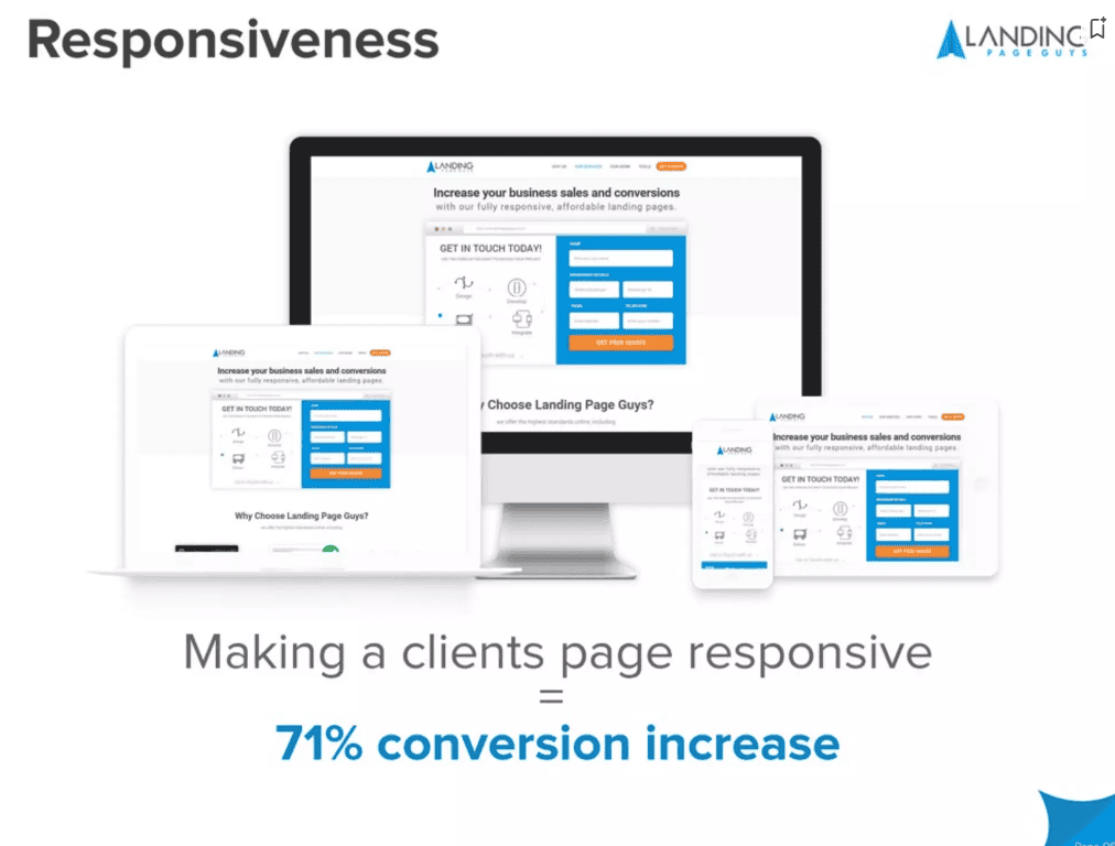
According to a recent presentation by The Landing Page Guys, making a page responsive can increase conversion rate by 71%. This makes sense as mobile traffic is only growing.
Simplified Navigation
For ecommerce landing pages, simplifying navigation is an essential design principle. To focus on the page’s primary goal and facilitate user access to information, unnecessary elements should be removed from the landing page in order to reduce distractions. Simplification of such a type can be achieved by eliminating unneeded links, streamlining menus so they are easy for visitors to see, altering content so that it corresponds with user intent better and honing in solely on delivering what users need most quickly when visiting any given website or app—all leading to higher profits through increased sales.
Social Proof
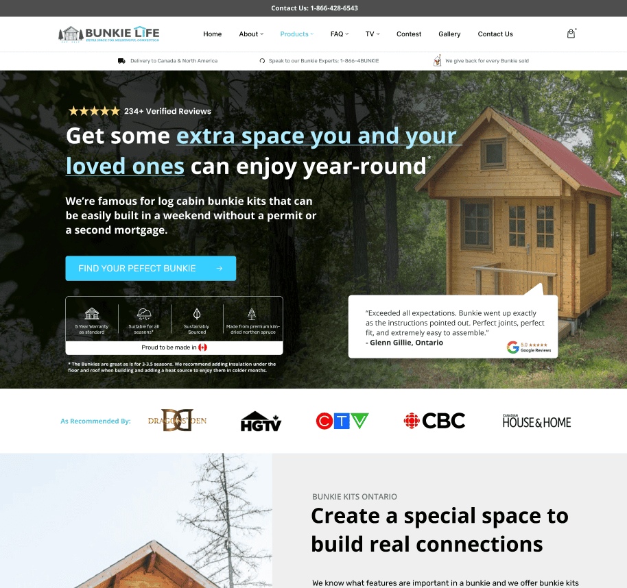
Bunkie Life have utilised strong call-to-actions on their new home page to really highlight their customers experiences, “above-the-fold”
Including social proof such as customer reviews, testimonials and trust badges on your ecommerce landing page can be instrumental in inspiring potential customers to take the desired action. Presenting users with endorsements from experts, influencers or celebrities along with encouraging comments about your offer is a great way to draw attention of target audience and spark conversions.
Using these techniques allows you to make an appealing and effective statement that generates more leads for your business than otherwise would have been possible without them. Customer feedbacks are essential elements which can help build credibility among consumers while simultaneously giving visitors greater confidence when making purchase decisions related to your website’s products or services.
Creating persuasive content through various types of social evidence shows what value they stand to gain by trusting it and this will ultimately drive a higher level of engagement within site’s visitor base overall, leading to increased sales volume!
Consistent Branding
Having a consistent branding across all your ecommerce landing page and marketing materials is key to creating a unified brand identity. You should ensure visual unity by utilizing the same color palette, font family, logo designs and tone of voice as indicated in the set of guidelines for your specific brand.
By putting an emphasis on maintaining consistency throughout this platform you can build up recognition towards what it is that you stand for and consequently drive more sales along with customer loyalty.
Your ecommerce site’s success will be dependent upon how well users are able to remember its look-and-feel, which makes uniformity critical!
Optimization Techniques for Ecommerce Landing Pages
When it comes to enhancing the performance of an ecommerce landing page, optimization techniques such as A/B testing, SEO optimization and user behavior analysis play a vital role. This is to utilizing proper design principles. To Increase conversions on your webpages, you need to use these methods so that actionable insights are gathered for making data-driven decisions.
We will now take a closer look into each one of those optimizations strategies. Firstly, through analyzing user behavior trends, accurate information can be obtained with which improvement areas may come up. Secondly, performing A/B tests enables us quickly determine what works better among different variations when compared directly against each other. And lastly, SEO practices must also be applied carefully so your pages appear highly ranked in search engine results during customers’ searches online about related products or services offered by yourself.
Then optimizing eCommerce Landing Pages requires several powerful tools if higher conversion rates are targeted – gathering intelligence from users behaviour surveys, using effective designs after countless trials via A/B Testing coupled with focusing on Search Engine Optimization set ups should return desirable outcomes at satisfactory speeds too!
A/B Testing
A/B testing is a useful optimization method that helps ecommerce landing pages analyze different variations of their site so they can discover the version with most conversions, clicks and other desired results. Optimizing components such as headlines, pictures and CTAs on your page lets you make data-driven decisions to maximize output from visitors who land there.
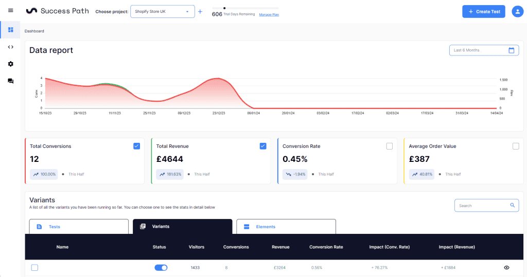
Tools like Success Path can help you run complex split testing on your website to find elements that can improve your conversion rate.
Tools like Success Path, HubSpot’s A/B Testing Kit, Freshmarketer VWO (and more) provide insights into user behavior which enables us to optimize an ecommerce landing page for higher conversions overall.
By employing these tools we gain precious understanding of what works best with our website’s users – thus letting us have data-backed approaches when optimizing each individual landing page in order to get more customer engagement out of it.
SEO Optimization
Optimizing ecommerce landing pages for SEO is essential to draw in organic visitors.
This can be accomplished by implementing key words, meta tags and other best practices which help boost visibility on search engine results pages (SERPs). Techniques like researching relevant keywords, designing with searcher intent in mind, streamlining URL structures for quick loading speeds and producing quality content all work together to attract potential customers.
A well maintained landing page allows you full control over the presentation of your product/service, thereby allowing you access a wider range of leads, helping improve sales conversions as a result.
AHREFs have put together a great blog running over the Shopify SEO, you should definately check this out if you’re currently running a Shopify Store.
User Behaviour Analysis
Monitoring user interaction on your ecommerce landing page helps identify areas that require changes and promote better performance. Google Analytics used in combination with Microsoft Clarity are useful tools for tracking visitors’ actions on the landing page in order to make decisions based on data-driven insights.
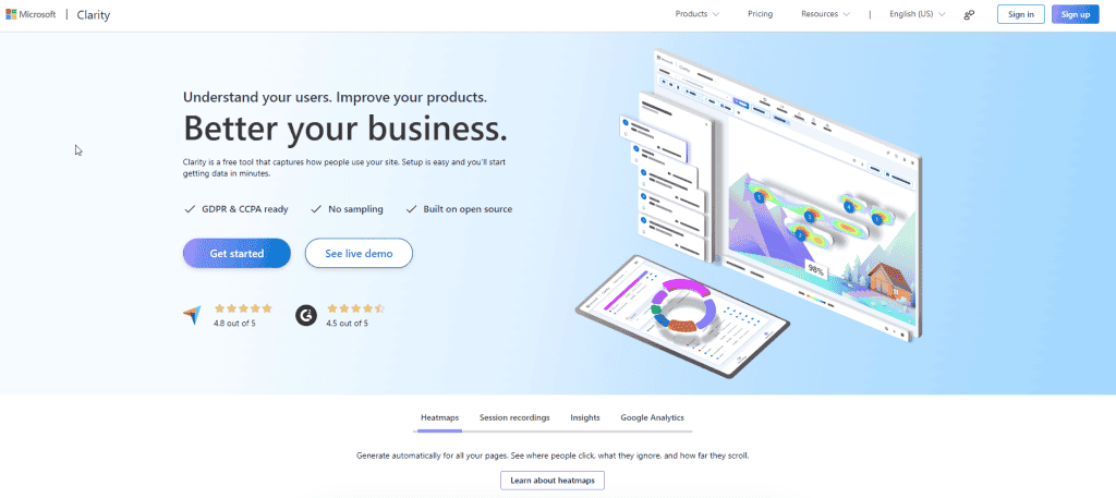
Microsoft Clarity has quickly become our go-to for heatmapping and session recording. The fun part? – It’s free forever!
Studying how people interact with a given site can deepen understanding of what elements have an effect and where you need Development. Taking advantage of such information enables one to take decisive steps towards improving their online store’s home page, which eventually leads to more conversion rates and sales opportunities.
Summary
Designing an ecommerce landing page that drives conversions and improves sales is both a creative process and based on research. To get the best results, it’s important to familiarize yourself with components of successful pages, apply design guidelines correctly while implementing optimization practices for maximum performance, this will assist in crafting a persuasive page. It also requires frequent updates combined with steady tracking of success metrics if you want your store’s profits to grow steadily over time. Keeping all these elements into consideration when constructing effective landings are key factors for any ecommerce business’ advancement.
Frequently Asked Questions
What is a product landing page?
A product landing page is a type of website post-click destination intended to market and sell products, or entice visitors into accepting an offer related to the item. It shares many similarities with other kinds of landing pages in terms of design elements.
What is the main purpose of an ecommerce landing page?
The primary objective of an ecommerce landing page is to increase sales, draw potential customers in and ultimately benefit your website. By crafting a well-designed advert for the product or service being offered, you can drive visitors to take action and convert them into paying customers.
What are some best practices for designing ecommerce landing pages?
For the ideal ecommerce landing page design, ensure your mobile experience is optimal, provide easily understandable navigation options, add social evidence to build trustworthiness and make sure there’s a consistent look throughout.
How can A/B testing be used to optimize ecommerce landing pages?
A/B testing is a useful technique to increase the effectiveness of ecommerce landing pages. Through comparison and analysis, it helps to identify which variation leads to higher conversion rates so decisions can be made accordingly.
How can SEO optimization help increase the visibility of my ecommerce landing page?
Through incorporating words related to your ecommerce landing page, meta tags and other optimization techniques into the webpages, SEO can be used to enhance visibility. This way it will help bring in potential customers along with organic traffic flow which could lead to increased exposure for the site.
