Did you know that a well-crafted call to action (CTA) can significantly boost your conversion rates? Creating effective CTAs is crucial as it involves good design, high visibility, clear benefit, actionable text, short length, and a sense of urgency. CTAs serve as powerful tools to guide your audience towards desired actions, ultimately increasing sales, subscriptions, and overall engagement. Ready to take your marketing campaigns to new heights? Keep reading for 70+ call to action examples and tips that will instantly revamp your conversion strategy!
Key Takeaways
Create motivating, well-designed CTAs to unlock your company’s potential.
Use action words and bright colors for high-converting website CTA examples in your digital marketing strategies.
Optimize design, text & placement with A/B testing to maximize conversions!
CTA Basics: What is a Call to Action and Why It Matters
A call to action is a clear and concise message that encourages website visitors to take a specific action, such as making a purchase, signing up for a newsletter, or requesting a demo. A call to action example could be a button with the text “Sign up now!” on a website. Guiding your audience through the customer journey and boosting conversion rates is a key function of call to actions. A compelling CTA is the key to unlocking your company’s potential and driving desired outcomes.
Understanding and utilizing effective cta language is crucial in crafting CTAs that resonate with your audience. Studying the language and positioning of CTAs used by competitors can provide valuable insights into using urgency phrases, direct CTAs, and benefit-focused language.
One should never underestimate the power of a straightforward call to action. When properly executed, a CTA can make the difference between a successful business and one that struggles to gain traction. Whether it’s through a CTA banner or a clickable button, a well-designed call to action copy can have a profound impact on your marketing campaigns, attracting customers, and driving results.
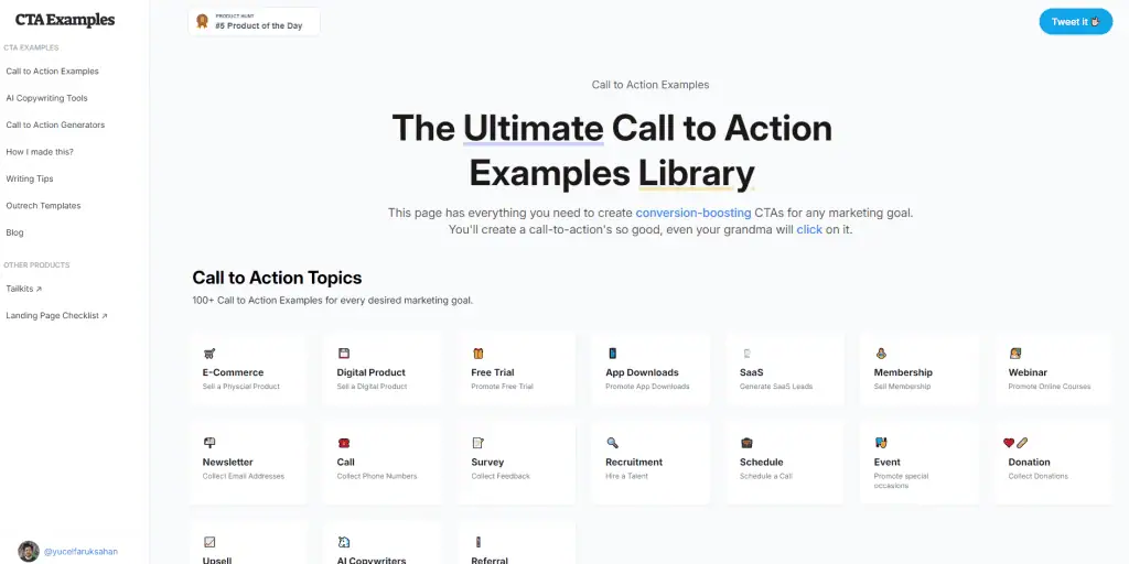
Looking for a Quick Fix or Cheat Sheet – Checkout CTAExamples.com:

CTA tracking is important, and can drive sales
Essential Elements of an Effective CTA
To maximize the impact of a CTA, it’s important to combine several key elements. First and foremost, clear language is essential. Your audience should know exactly what to expect when they click on your CTA button. Using action-oriented verbs, such as “Buy now” or “Get started,” can make your CTA more dynamic and captivating, prompting readers to take action immediately.
Incorporating direct CTAs, like those used by competitors, can be highly effective in prompting immediate user action.
Aside from language, incorporating a sense of urgency adds a layer of persuasion to your CTA. When visitors feel that they might miss out on an opportunity, they are more likely to act quickly.
Ensuring your CTA stands out and is memorable requires a good dose of creativity. Explore our 70+ CTA examples to help spark your imagination and create powerful call-to-action buttons that will drive results.
While an effective CTA can significantly boost your conversion rates, don’t forget to continuously test and optimize your CTAs. By experimenting with different elements, such as:
design
text
color
placement
By utilizing point blank seo strategies, you can uncover the best performing version for your target audience and maximize your marketing campaign’s success.
High-Converting Website Call to Action Examples
This section presents high-converting CTAs for different website types, such as e-commerce, blog subscriptions, and service-based businesses. These examples showcase how a well-crafted CTA can drive engagement, boost sales, and help you reach your marketing goals. Using multiple CTAs strategically can further guide user actions and increase engagement by catering to different audience segments.
Let’s get started!
E-commerce CTAs
E-commerce CTAs play a significant role in driving sales and customer engagement for online stores. The primary call to action on an e-commerce website should be clear, concise, and compelling, encouraging users to make a purchase or take another desired action. A secondary CTA can support the primary action by offering additional options, such as signing up for a newsletter or exploring related products.
Some brilliant examples of e-commerce CTAs include:
“Shop Now”
“Add to Cart”
“Save 20% Off”
“Start Free Trial”
These call-to-action buttons on your landing page can help you attract more customers and increase your average order value. Offering a risk-free proposal or consultation is another effective way to encourage users to take the next step in the buying process, ultimately increasing your conversion rates.
To further optimize your e-commerce CTAs, consider implementing the following strategies:
Use action words
Use bright colors
Create a sense of scarcity or use holiday marketing tactics
Use single buttons
Incorporate gamification techniques
These strategies can effectively capture your audience’s attention and maximize the impact of your CTAs.
Blog Subscription CTAs
Blog subscription CTAs are designed to motivate visitors to subscribe to blog newsletters and updates. A compelling call to action, such as “Join our community,” can effectively drive subscriptions and grow your readership. Examples of successful blog subscription CTAs include “Subscribe Now,” “Join Our Newsletter,” and “Get Updates.” By incorporating these calls to action into your blog, you can create a vibrant community of like-minded individuals and provide access to valuable resources.
Placing CTAs strategically within the body of a blog post can drive user actions, such as subscribing to a blog newsletter, downloading resources, or sharing the post on social media.
Several factors need to be considered when designing blog subscription CTAs, including:
Language
Opt-out hyperlinks
Viewer incentives
Contrasting colors
A well-designed CTA banner can significantly increase subscription rates and keep your readers engaged.
Service-based CTAs
Service-based CTAs prompt users to request demos, consultations, or other services, ultimately driving user engagement and conversions. Examples of effective service-based CTAs include “Schedule a Demo,” “Book a Consultation,” and “Get Started Today”.
By incorporating CTAs into your service-based business, you can quickly move potential customers through the buying process and grow your email marketing list. Offering a free proposal or consultation is an effective way to encourage users to take the next step and explore your services.
Remember, your CTA’s success relies on its design and placement. Ensure that your call to action stands out on the page and is easily accessible to your website visitors. With the right combination of language, color, and design, your service-based CTAs can significantly boost conversions and enhance your business’s success.
Social Media Call to Action Examples
Social media platforms like Facebook, Instagram, and Twitter offer unique opportunities to engage with your audience and generate leads. This section covers effective CTAs for various social media platforms and offers tips on creating powerful call-to-action buttons that drive user engagement and conversions. A consistent and engaging marketing message in your social media CTAs is crucial for improving conversions and customer engagement.
Facebook CTAs
Facebook ads provide an excellent platform for businesses to reach their target audience and drive conversions. By incorporating compelling CTAs into your Facebook ad campaigns, you can encourage users to take the desired action and enhance your campaign’s effectiveness.
Examples of successful Facebook ad CTAs include:
“Shop Now”
“Sign Up”
“Learn More”
“Book Now”
“Get Offer”
“Contact Us”
“Download”
“Watch Video”
These call-to-action buttons can help you maximize engagement and drive results for your marketing campaigns.
For your Facebook ads’ CTAs, using clear language, high color contrast, and a prominent placement can help your call to action stand out on the page. By carefully crafting your Facebook CTAs, you can improve your ad’s performance and increase your return on investment.
Instagram CTAs
Instagram ads and posts can benefit from attention-grabbing CTAs that encourage user engagement and conversions. By incorporating captivating call-to-action buttons into your Instagram content, you can effectively drive traffic, generate leads, and boost sales.
Examples of successful Instagram CTAs include:
“Swipe Up”
“Shop Now”
“Get Yours Today”
“Learn More”
These CTAs can help you entice your followers and drive them to take the desired action.
To optimize your Instagram CTAs, consider using the following strategies:
Use tantalizing visuals to capture your audience’s attention
Use intriguing language to pique their curiosity
Create a sense of immediacy to encourage immediate action
By strategically designing your CTAs, you can maximize your Instagram posts’ impact and boost your overall marketing efforts.
Twitter CTAs
Twitter is a powerful platform for driving user interaction and conversions. By incorporating compelling CTAs into your tweets and promoted content, you can encourage users to engage with your brand and take the desired action.
Examples of effective Twitter CTAs include:
“Follow Us”
“Retweet”
“Share”
“Sign Up”
“Download”
“Learn More”
“Shop Now”
“Book Now”
“Donate Now”
These call-to-action buttons can help you maximize your Twitter content’s reach and impact.
When designing Twitter CTAs, it’s essential to use clear, concise language that motivates users to take action. By carefully crafting your call-to-action buttons and strategically placing them within your tweets, you can drive user engagement and bolster your marketing campaigns’ success.
Email Marketing Call to Action Examples
Email marketing provides a unique platform to connect with your audience and drive conversions. This section delves into powerful CTAs for various types of email marketing campaigns, including promotional offers, newsletters, and event invitations. It is crucial to use effective CTAs across various marketing materials such as emails, newsletters, and ads.
Let’s explore!
Promotional CTAs
Promotional CTAs can significantly boost sales and conversions in your email marketing campaigns. By incorporating compelling call-to-action buttons into your promotional emails, you can drive user engagement and motivate customers to take the desired action.
Examples of effective promotional CTAs include:
“Get 50% off”
“Limited Time Offer”
“Buy Now and Save”
“Order Now”
These call-to-action buttons can help you attract more customers and increase your average order value.
Remember, the success of your promotional CTA relies on its design and placement. Ensure that your call to action stands out on the page and is easily accessible to your email recipients. With the right combination of language, color, and design, your promotional CTAs can significantly boost conversions and enhance your email marketing campaign’s success.
Newsletter CTAs
Newsletter CTAs are designed to encourage readers to subscribe to newsletters and stay informed about new content. By incorporating compelling call-to-action buttons into your newsletter, you can grow your subscriber list and create a vibrant community of engaged readers.
Examples of successful newsletter CTAs include “Subscribe Now,” “Join Our Mailing List,” and “Get Updates”. These call-to-action buttons can help you attract new subscribers and provide valuable resources to your existing readers.
Designing newsletter CTAs involves taking into account factors like:
Language
Opt-out hyperlinks
Viewer incentives
Contrasting colors
A well-designed CTA banner can significantly increase subscription rates and keep your readers engaged.
Event Invitation CTAs
Event invitation CTAs play a crucial role in prompting recipients to register for events or webinars. By incorporating compelling call-to-action buttons into your event invitations, you can encourage attendees to RSVP, register, or take any other desired action.
Examples of motivating event invitation CTAs include “Register Now,” “Save Your Spot,” and “Join Us”. These call-to-action buttons can help you drive traffic, generate leads, and boost conversion rates for event organizers.
Remember, the success of your event invitation CTA relies on its design and placement. Ensure that your call to action stands out on the page and is easily accessible to your invitation recipients. With the right combination of language, color, and design, your event invitation CTAs can significantly boost attendance and enhance the success of your event.
CTA Button Design Tips and Best Practices
The effectiveness of a simple CTA not only lies in its message but also in its visual appeal. By following some essential design tips and best practices, you can create CTAs that stand out and drive user engagement.
First, utilizing color contrast is crucial for making your CTA button noticeable against the background. High color contrast ensures that your call to action grabs your audience’s attention and encourages them to click.
Next, consider the size and placement of your CTA button. A larger button is more likely to catch the eye, but it should be balanced with the overall design of your web page or email. The placement of your CTA also plays a significant role in its effectiveness. Positioning your call to action above the fold, or within the top half of your web page, can make it more visible and increase the chances of user interaction. The strategic placement of CTAs within your content, such as how the ‘cta appears’ in blog posts from Grammarly and Zapier, can significantly impact user engagement by encouraging actions like subscribing to a newsletter or sharing content on social media.
Finally, continuous testing and optimization of your CTAs is imperative. A/B testing is a powerful tool that allows you to experiment with different designs, texts, colors, and placements to find the best performing version for your target audience. By consistently testing and refining your CTAs, you can maximize their impact and boost your overall conversion rates.
A/B Testing Your CTAs for Maximum Impact
A/B testing is a proven technique to find the most effective version of your CTA for your audience, thereby maximizing conversion rates. By comparing two or more versions of your CTA, you can identify which design, text, color, or placement generates the most leads or conversions.
Using the same CTA across different tests ensures consistency and accurate results, as seen with Zapier’s newsletter subscription CTA appearing at the end of each article on its blog.
To set up an A/B test for your CTAs, follow these steps:
Identify the CTAs you want to test.
Determine the goal of the test.
Create two versions of the CTAs.
Split your audience.
Implement the test.
Monitor and collect data.
Analyze the results.
Implement the winning variation.
Remember, A/B testing is an ongoing process, and continuous testing and optimization of your CTAs is crucial. By experimenting with different elements and regularly monitoring your results, you can improve your call-to-action buttons’ effectiveness and boost your overall marketing efforts.

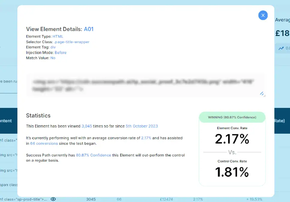
In Q4 – we ran a simple text experiment for one of our E-Commerce clients to see if changing the CTA along would have a positive impact to Sales. This was the result of the test on Success Path after just 30 days of testing for a single product. Over 20% uplift in a single test!
Summary
In conclusion, CTAs are powerful tools that can significantly boost your conversion rates and drive user engagement. By understanding the basics of CTAs, implementing essential elements, and utilizing high-converting examples across various platforms, you can create compelling call-to-action buttons that resonate with your audience. Don’t forget to follow design tips, best practices, and A/B test your CTAs for maximum impact. Creating effective CTAs by focusing on good design, high visibility, clear benefit, actionable text, short length, and a sense of urgency is crucial for boosting conversion rates. Now, it’s time to put these strategies into action and transform your marketing campaigns!
Frequently Asked Questions
What is an example of call to action?
Simple calls to action like “Buy Now” or “Download Now” can be effective, but using action words like “Subscribe,” “Get Started,” and “Swipe Up” can give your content meaning and help readers make decisions quickly.
How do you write a call to action?
When writing a call to action, start with a strong verb and use language that is clear and motivating. Use adverbs or subjects to add detail, include words that provoke emotion or enthusiasm, give your audience a reason to act, and be bold in your CTA copy.
What are some examples of a call to action on a website?
“Buy Now”, “Download Now” and “Subscribe today” are examples of simple calls to action. Use “add to cart”, “order”, “shop”, “try”, “get started”, “sign up”, “swipe up”, “continue” and “see more” for additional ideas, all written in the first person to grab attention and prompt readers to respond.
How can CTAs boost conversion rates?
CTAs can help direct visitors to take the desired action, resulting in increased conversions and higher engagement rates.
What are the essential elements of an effective CTA?
A successful CTA should feature concise language, an actionable verb, a sense of urgency, and an innovative approach.


